The Ultimate HDB Color Palette Guide (2025 Edition)
How to Choose Colors That Make Your Home Feel Bigger, Brighter, and Calmer
Choosing the right color palette is one of the most powerful decisions you’ll make during your renovation. The colors you select don’t just fill your walls—they shape how you feel in your space, define its mood, and tie your entire home together.
If you’re renovating your HDB, BTO, or condo in Singapore, this guide will walk you through how to build a cohesive, timeless color scheme — whether you love warm Japandi tones, minimalist neutrals, or something bolder.
Let’s explore how to create a home that feels calm, spacious, and uniquely yours.
1. Start with the Mood You Want to Create
Every home has a mood. Some feel calm and airy, while others radiate warmth and energy.
Start by defining how you want your space to feel.
Color Psychology Basics:
Color Psychology Basics
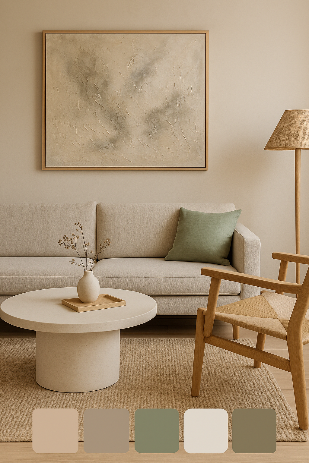
Pro-Tip: If you’re designing a Japandi or minimalist home, stick to calming hues like beige, greige, sage, and stone white — they blend beautifully with wood textures and natural light.
Color Palette with calming hues like beige, greige, sage, and stone white
2. Choose a Base Color
Once you’ve decided on the mood you want to create, choose a base color that will serve as the foundation for your palette. This will be the dominant color used on larger surfaces like walls, floors, or cabinets.
Base Color Ideas for Singapore Homes:
• Japandi Minimalist: Warm greige, beige, or off-white
• Modern Classic: Taupe, sand, or light grey
• Contemporary Dark: Charcoal or Deep Navy
Pro-Tip: If you’re unsure where to start, consider using your home’s architectural features—like large windows or natural lighting—as a guide. Natural light can enhance or soften certain colors, so choose shades that work well with the amount of light your space receives.
3. Add Accent Colors for Depth & Personality
Once your base is set, layer in accent colors for visual interest — in furniture, walls, or decor.
How to Choose Accent Colors
Complementary (e.g., blue + orange): creates contrast and energy.
Analogous (e.g., beige + taupe + brown): calm, harmonious.
Monochromatic (e.g., different shades of greige): sleek and cohesive.
🪄 Designer Insight:
If your base is neutral, accents can come from natural materials — rattan, terracotta, stone, or even plants — instead of paint.
4. Color Tips for Small HDB & BTO Spaces
The size and layout of your HDB flat should influence your color choices. Certain colors can make small spaces feel more open, while others can help define zones or create focal points in an open-concept layout.
In smaller homes, color can dramatically change the sense of space.
✅ Use lighter tones like off-white, ivory, or pastel beige to reflect light and open up rooms.
✅ Create depth with one feature wall in a darker shade (like mushroom taupe or sage green).
✅ Maintain flow by using the same undertone (warm or cool) throughout your flat.
✅ Connect zones — use rugs, furniture, or curtains in similar hues to tie spaces together.
🪞 Pro Tip: Mirrors amplify light and color harmony. Position them to bounce warm tones across the room.Pro-Tip: Use mirrors to enhance the effect of light colors, helping your small flat feel even more open and spacious.
5. Balance Bold and Neutral Hues (The 60-30-10 Rule)
A well-balanced color palette combines both bold and neutral hues. This balance ensures that your space feels dynamic and interesting, without being overwhelming. In Japandi or minimalist designs, neutral tones tend to dominate, but even these spaces benefit from a pop of color here and there.
Design harmony comes from balance — not excess.
Follow this classic designer rule:
60% Base Color (walls, large surfaces)
30% Secondary Color (furniture, rugs)
10% Accent or Bold Color (decor, art, plants)
Example for a Japandi Living Room:
60% Warm greige walls
30% Natural oak wood tones
10% Black, brass, or greenery accents
This mix keeps your home calm but never boring.
Home Office with earthy and grounded color in Clay Beige, Olive Green, and Cream
6. Test Colors Before You Commit
Paint colors shift dramatically under different light conditions. Always test before committing.
How to Test:
Paint a 1m x 1m swatch on the wall and observe it at morning, noon, and evening.
Use sample boards (from Nippon, Dulux, or Benjamin Moore).
Test in both daylight and artificial light (LED or warm bulbs).
Pro-Tip: If you’re painting multiple rooms, test colors in each room to see how they interact with the natural light and existing decor.
7. Harmonize with Furniture and Decor
Your color palette should work in harmony with your furniture and decor. If you already have key furniture pieces, choose a color scheme that complements those items. On the other hand, if you’re starting from scratch, you can build your color palette and then select furniture that fits within it.
How to Harmonize Colors:
• Neutral Furniture: Neutral-colored furniture (like white, grey, or beige) is versatile and works with almost any color palette. This gives you the flexibility to experiment with bolder colors on walls or accessories.
• Bold Furniture: If your furniture makes a statement, such as a brightly colored sofa or patterned chairs, keep the walls and larger surfaces neutral to let those pieces stand out.
• Coordinating Decor: Use decor pieces like cushions, rugs, and curtains to tie your color palette together. These elements help create a cohesive look without overwhelming the space.
Pro Tip:
Plants act as “living color accents.” Eucalyptus, monstera, or olive trees bring soft greens that ground neutrals beautifully.
8. Our Favorite HDB Color Palettes for 2025
Favorite HDB Color Palettes
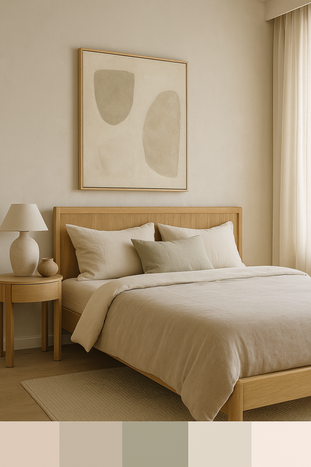
Japandi Bedroom in Greige, Warm White and Oak Wood Furniture
Dining room in Modern Neutral with Taupe, Ivory, and Metal Black for timeless design
Final Thoughts:
Choosing the perfect color palette for your HDB renovation doesn’t have to be daunting. By focusing on the mood you want to create, balancing bold and neutral colors, and considering the size and layout of your space, you can create a harmonious, beautiful home that reflects your personal style.
Whether you’re aiming for a serene, minimalist retreat or a vibrant, energetic space, the right color choices will bring your vision to life. Don’t be afraid to experiment, and most importantly, choose colors that make you feel at home.


